Thursday 30 April 2015

How did you use media technologies in the construction and research, planning and evaluation stages?

So that all aspects of my project are accessible from one place I decided to use a blog to present my research and planning. I used YouTube and SoundCloud to put music and video files on my blog that I set up using Blogger.


I used a Canon 500D to film my teaser trailer. I liked using this camera as it has the ability to playback video and images straight away, which makes it easier when deciding which shots I liked and which I didn't. I used Avid editing software to edit my teaser trailer. I started off by organising my shots into edit bins in the order I wanted them in. I went on to photoshop and made the taglines that I wanted to appear in my trailer. 

For a few reasons there were some shots that during the editing process didn't end up being used as either the lighting was wrong or they no longer fit the narrative. There was one shot where I decided to take the dialogue and use it over the top of another shot, kind of as a voice over. Other shots I trimmed and turned into stills as they are only on screen for a small amount of time. Using the multitrack feature I organised all my shots into one layer then put the music, that I got from Spotify then used Adobe Audition to edit the tracks, and captions into separate ones. 

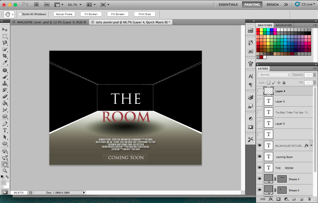
To edit my poster and magazine cover I used Adobe Photoshop CS5.1. This software allowed me to edit all aspects of my poster and magazine including the text, images and colour. 

The editing stages of my magazine editing process. 


Stages of my poster editing process: 


How affective is the combination of your main product and ancillary texts?

When marketing any product it is important to keep a sense of continuity throughout the campaign. Visuals are a huge part of what makes the consume want to see a film, what they see on the posters and trailers  can make even more of an impact than the narrative itself. Using the same techniques throughout the campaign keeps reminding people that may see the film what the film is saying and what genre it comes from.

To ensure that I had a unified campaign I kept many elements the same throughout, such as the font. Font is crucial when indicating genre so it is important to make sure that it is a big part of the marketing campaign. While doing my research into different fonts that are often used for different genres I found that, more often than not, fonts that have an old fashioned feel to them were used for films from the horror genre. The font I decided to use 'Trajan Bold' as it not only had the old fashioned look that I wanted, it also looked bold enough to be the main focus of a film marketing campaign. I used this font on my poster and for all the text and taglines used in my trailer.


Despite using the same font for my poster and trailer, I didn't use it when designing my magazine cover as each magazine has it's own style independent from that of the film. Magazine companies often have a neutral font so that they don't only appeal to one type of person. Production companies can often request which image they want the magazine to use, but its is much harder to get them to change the font. Some bug budget films that create a lot of hype can sometimes be given special edition covers by mainstream magazines.

I wanted to make the taglines in the trailer feel very personal to the audience and also give them a sense of knowing something that the people involved in the narrative don't. 'The stories of their past' makes the audience interested in what the narrative if the story is. Just as with the font there is no tagline on the magazine cover as it is it's own independent publication.

When it came to choosing images for my campaign I chose different ones for the magazine cover and the poster. The image on the poster is an image that links to the films narrative whereas the image seen on the magazine cover is of the director of the film. In other types of publications it would be of an actor that appears in the film.

Billing stays the same throughout the marketing campaign , though different font is used on the poster and in the trailer.


In what ways doe your media product use, develop or challenge forms and conventions of real media product?

My A2 media project fiches on creating a marketing campaign that includes a magazine cover and a poster that advertise for the film that I made a teaser trailer for. To ensure that my media texts would advertise my film in the best way I researched into how real films are marketed to get the best response from the consumer.


I looked at a number of existing teaser trailers, from films of all different genres, to give me a a better understanding on how they are structured. I looked at trailers for 'Transformers' and  'The Dictator'. I looked at both the teaser and the theatrical trailers for both and compared the differences. 


Some of the conventions I found in teaser trailers were: production logos always appear at the beginning of the trailer, if the film is based on a novel then then in the middle of the trailer 'based on the book by...' will appear on the screen. A rough idea of when the film is due to be released and tagline are featured in teaser trailers as well. The way the trailer is edited is also an indication that is it a teaser trailer rather than a full length. As it is only a teaser of what the film is about, fast editing techniques will be used to create tension. Music helps the audience distinguish which genre the film is from as most teaser trailers share the same conventions other than the music used. 


Film posters are one of the main ways that a someone can work out which genre a film is from. I looked at a wide range of different posters from all different genres including The Dark Knight Rises, What To Expect When You're Expecting, The Woolf Of Wall Street, The Woman In Black and Titanic.  I then annotated them to show their different conventions. 


I took all these conventions into account while making my own poster and started looking at posters from the genre my film is from. Since I made a horror film I looked at conventions of posters from Dark Skies, Insidious, Texas Chainsaw Massacre (remake), The Conjuring and 13 Sins. 


I wanted to use a similar layout to the Insidious poster as I like that it is landscape because it is different from most other film posters, making it stand out and look eye catching. I also copied lots of the conventions found in it too. 


- Billing at the bottom of the poster. 


- Name of film in the middle of the poster with background image that shows narrative. 


- Reviews. 

Despite there being two types of film publications, one for mainstream Hollywood films and the other that focuses more on independent films, theres are some conventions that still stay the same. For example, masthead, barcode, issue number and date all stay the same. 

Having looked at both mainstream magazines like Empire and Total film and more independent ones I decided to design a cover for a publication similar to Sight And Sound. 


- Name of Magazine 


- Main coverline 


- Other coverlines 


- Barcode, date, issue number. 

Thursday 2 April 2015

Magazine cover response questionnaire.

1) Do the colours used capture your attention?
yes/no

2) The cover-lines interest you?
yes/no

3) Does the name of the name 'Reel Film' tell you what kind of film magazine it is?
yes/no

4) Does the cover image interest you?
yes/no

Film Poster.

For my film poster I wanted the main focus to be on what the film is about, as I saw this as a convention in other posters I looked at. My film is called 'The Room' so I decided to use the inside of an empty room as the image for my poster.


Wednesday 1 April 2015

Magazine sketch 3.


Magazine covers.

The cover of a magazine is deigned to catch the readers attention, so depending on the magazines target audience they will put different features on the cover. 

A film magazine which is marketed towards the main stream market like Empire and Total Film, for people who are interested in reading about the latest big budget hollywood films, will have pictures of actors that star in the film. The magazine will include articles on mainstream films and interviews will feel known actors. 

Other magazines, that are marketed to more of a indie, foreign film audience will use an interview with a lesser known director as their cover feature as the readers are more interested in the art behind making film rather than the stars that are in them. 

Certificate.

The BBFC (British Board of Film Classification) watch every film that is due to be screened in this country. They will then give it  certificate, U to 18, that indicates the age that a person has to be to see the film. The lower the rating, the more people will be able to watch the film as it will reopen to people of many ages. 


Often filmmakers will make cuts to their film to get it a lower rating. However it is important to remember that some film genres work better when they feature scenes that would only be shown in films that have a higher certificate. 

Horror/thriller films have previously been released baring an 18 certificate, but in recent years production companies have decided that it makes more sense to leave out certain aspects to get their film a 15 certificate. Meaning more people will be able to see it. I too have decided to make my film eligible for a 15 certificate.